

Product Design
Auder
Audio Tour App
Role
UX Designer
Year
2021
Industry
Tourism & Culture
Client
Google UX Design Certificate
Services
UX Research, Wireframing, Prototyping, Usability Testing
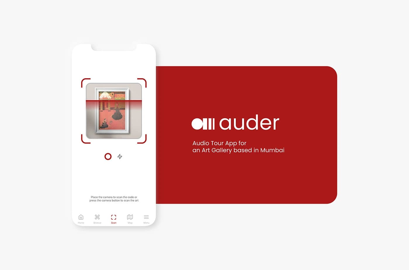
An app which helps users hear the audio tour of any artwork in an art gallery based in Mumbai — letting them access information about events, activities, and exhibitions at their own pace.
Quick Overview
Designed an audio tour app for an art gallery in Mumbai that lets visitors scan artworks to hear guided audio, browse collections, explore events, and navigate the gallery via an interactive map. Built over 9 weeks with two rounds of usability testing driving key design iterations.
9 Weeks
Duration
Jun–Jul 2021
Timeline
Figma
Tool
End-to-End Case Study
Type
Key Outcomes
Problem
The Problem
Most users have problems while inside the art gallery — they have to hire a guide, follow them, and can't enjoy the art at their own pace. Some users struggle because guides aren't affordable, and those who do hire one can't wait or spend extra time with artworks they love.
Costly Guides
Guides were not affordable for most users in the art gallery, charging a huge amount most of the time.
Wayfinding
Most users find it difficult to find their way to the art — they usually get lost or confused navigating the space.
Can't Enjoy the Art
If users hire a guide, they need to follow them until the tour is over and can't spend extra time with pieces they love.
Goal
The Goal
Design an audio tour app which lets users hear the audio tour about a particular artwork and guides them completely inside the art gallery — eliminating the need for expensive human guides while giving visitors full control over their experience.
Research
Understanding the User
Conducted user interviews and created empathy maps to understand the target users. The primary audience included working professionals who love art but need explanations, and art-knowledgeable users who sometimes need more context. Research began with quantitative methods to identify common problems during gallery visits.
User Interviews & Empathy Maps
Interviewed gallery visitors to understand their habits, frustrations, and what makes a memorable gallery experience.
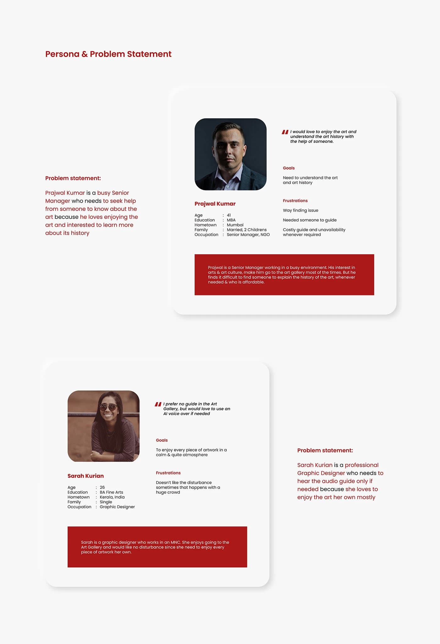
Persona: Prajwal Kumar
A 41-year-old Senior Manager (NGO) from Mumbai who loves enjoying art and understanding its history, but finds it difficult to find an affordable guide whenever needed.
Persona: Sarah Kurian
A 26-year-old Graphic Designer from Kerala who prefers no guide in the gallery but would love to use an AI voice over if needed — she wants to enjoy every piece in a calm, quiet atmosphere.
Pain Points
User Research: Pain Points
Through research, three core pain points emerged that shaped the design direction for Auder.
Costly Guides
Guides were not affordable for users, charging a huge amount most of the time.
Wayfinding
Most users find it difficult to find ways to the art — they usually get lost inside the gallery.
Can't Enjoy Art for Long
If they hire a guide, they need to follow them till the tour is over and can't wait if they want to spend extra time.
Wireframes
Starting the Design
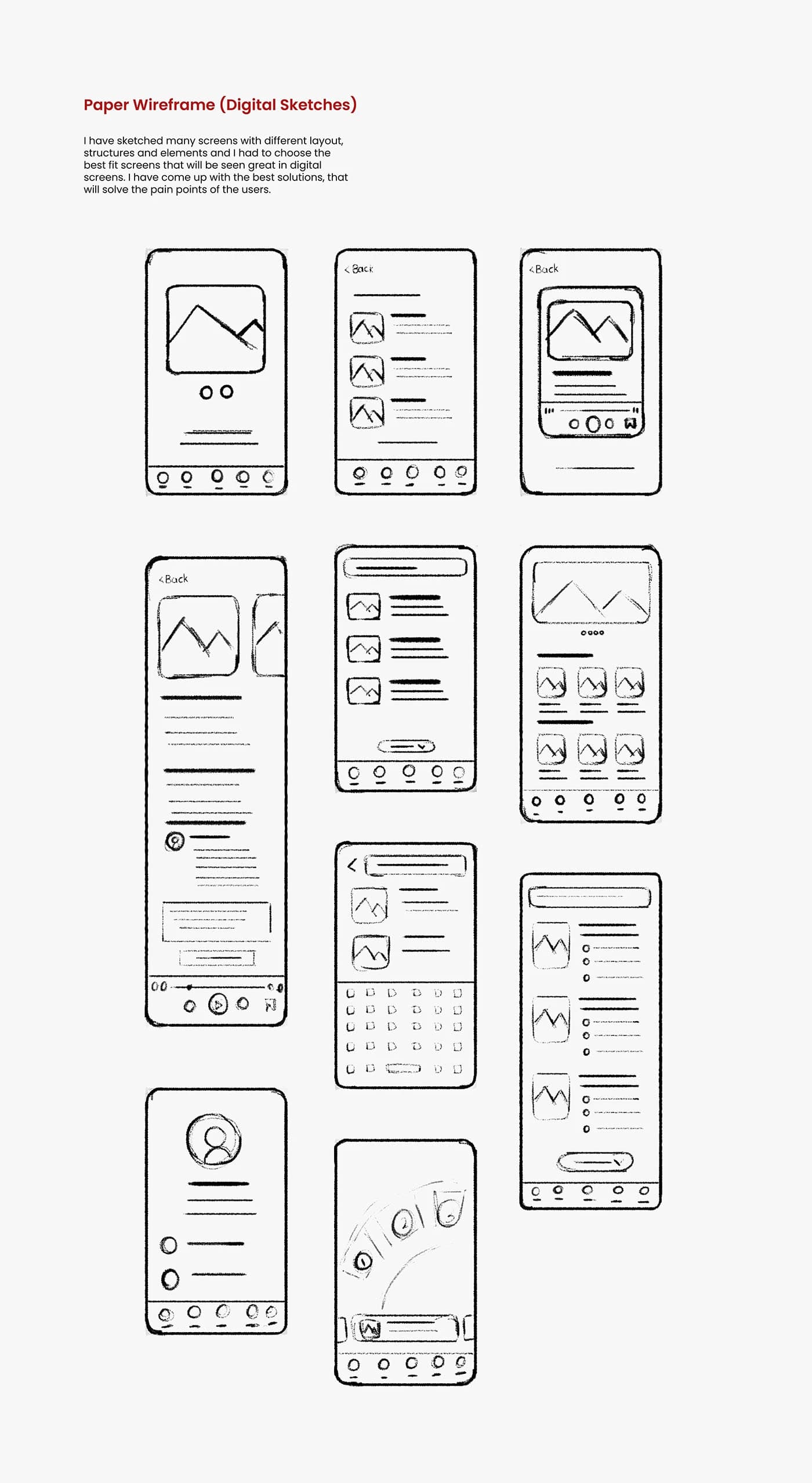
I sketched many screens with different layouts, structures, and elements, then chose the best fit screens for digital wireframes. The wireframes addressed the key user flows: scanning artworks, browsing collections, viewing art details with audio playback, exploring events and exhibitions, and navigating via map.
Paper Wireframes
Explored multiple layout options for each screen — scan, scan results, art list card, art details, browse, explore, search, and menu — to find the best solutions that solve user pain points.
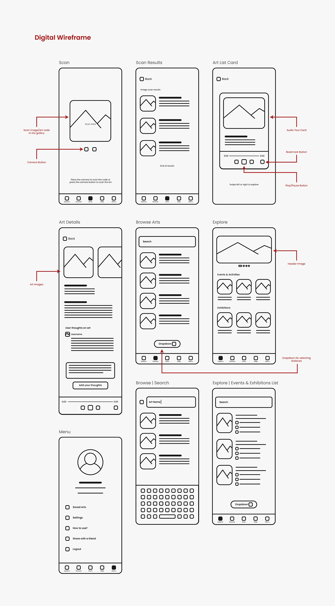
Digital Wireframes
Translated the best paper wireframe concepts into digital wireframes with annotated callouts: scan image/art code functionality, camera button placement, audio tour cards with play/pause and bookmark controls, browse with search and dropdown filters, explore with header image and gallery selector, and a full menu system.
Prototype
Low-Fidelity Prototype
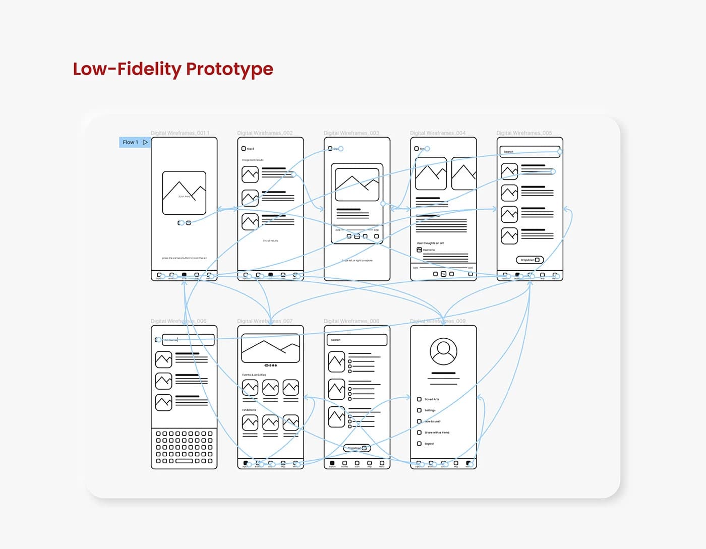
Connected the digital wireframes into a complete low-fidelity prototype flow in Figma, linking all 9 screens with interaction flows to test the core user journeys: scanning artwork, browsing the collection, playing audio tours, exploring events, and accessing the menu.
Usability
Usability Studies: Findings
Two usability studies were conducted — one for the low-fidelity prototype and another after the high-fidelity prototype. From the first study, the 'Explore' and 'Browse' menu labels were confusing users, though the overall flow was solid. From the second study, users needed different language options for the audio tours.
Language Options
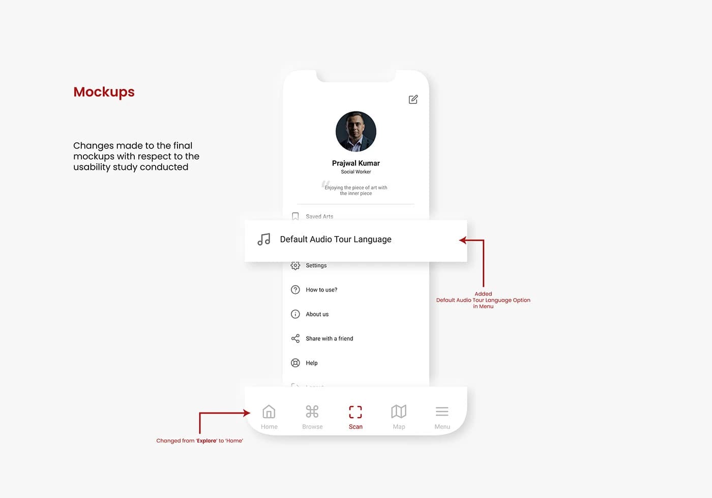
Users needed audio tours available in different languages — this was added as a 'Default Audio Tour Language' setting in the menu.
Explore & Browse Confusion
The 'Explore' and 'Browse' menu labels were confusing users — 'Explore' was renamed to 'Home' in the final design.
Mockups
Refining the Design
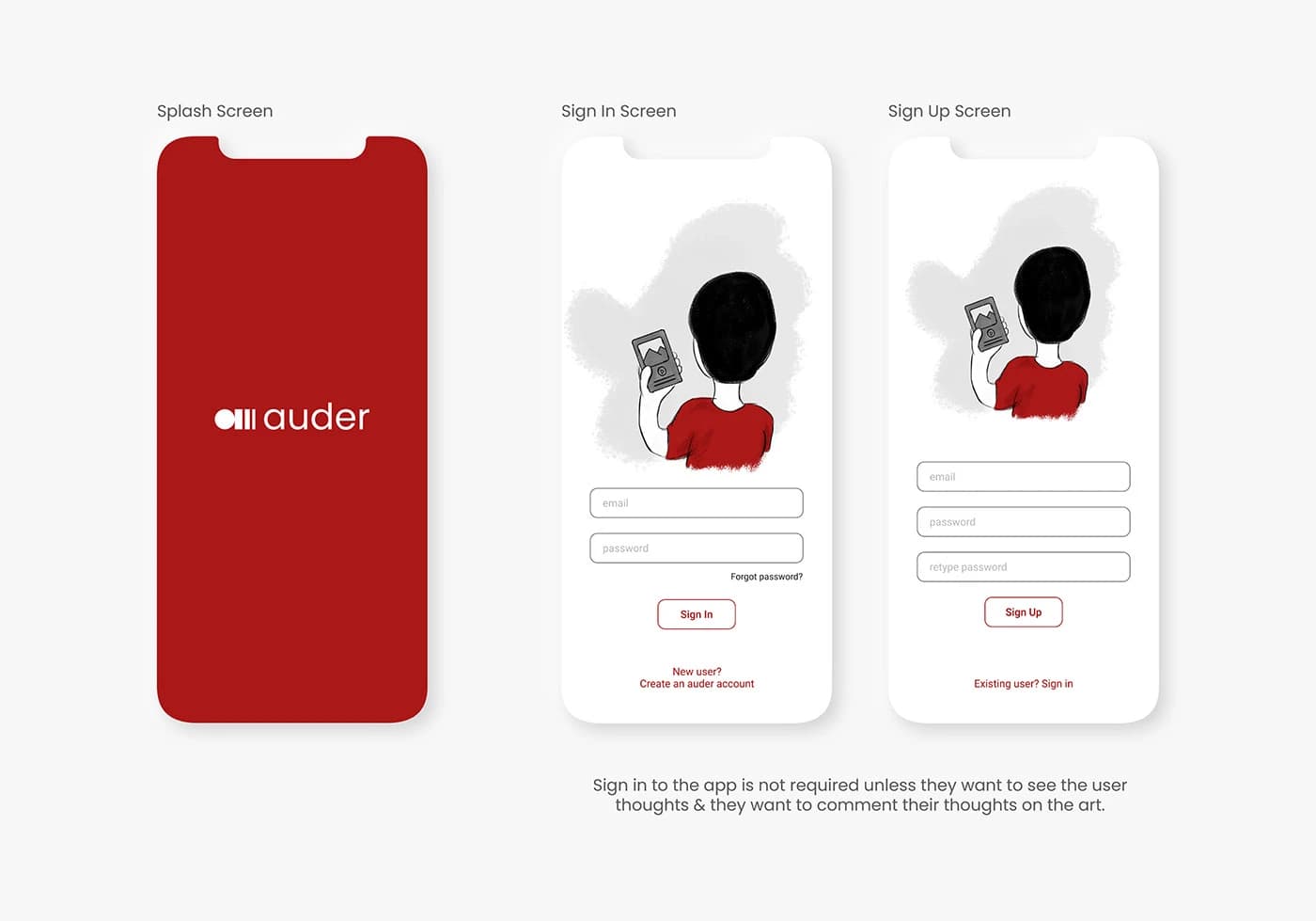
Based on the usability study findings, key changes were made to the final mockups: 'Explore' was renamed to 'Home' in the bottom navigation for clarity, and a 'Default Audio Tour Language' option was added to the menu so users could listen to tours in their preferred language.
Final Design
Final Mockups
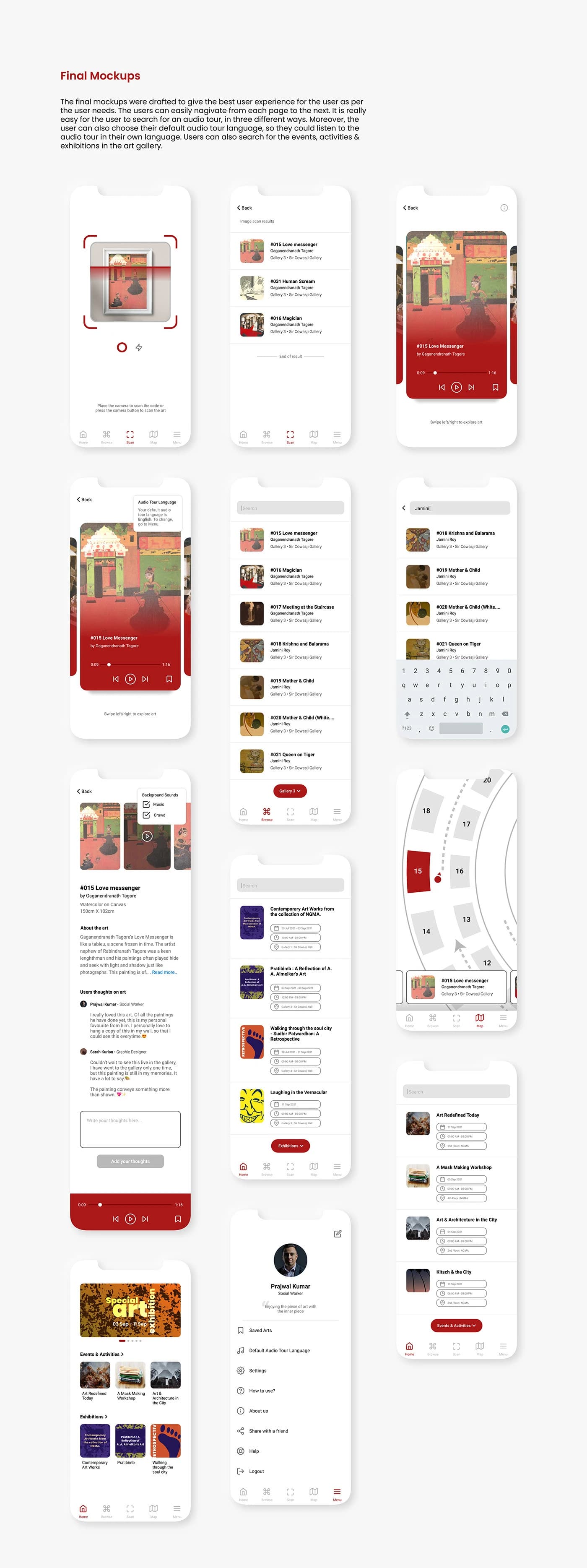
The final mockups deliver the best user experience with easy navigation between pages. Users can search for audio tours in three different ways: scanning artwork codes, browsing the collection, or using the gallery map. They can also choose their default audio tour language, and browse events, activities, and exhibitions happening at the gallery.
Accessibility
Accessibility Considerations
Accessibility was a core consideration throughout the design process, ensuring the app is usable by the widest possible audience.
Images & Videos
Rich visual content with images and videos were added throughout the app to support users who prefer visual learning.
Icons for Navigation
Icons were used throughout the interface for easy, intuitive navigation — reducing reliance on text alone.
Multiple Languages
Audio tours are available in different languages, making the app accessible to international visitors.
Takeaways
Going Forward
This app will change the experience of visitors in the art gallery and users who want to see the gallery virtually. Through the research and design process, many initial assumptions were challenged — the first ideas improved significantly by the final iteration, and peer feedback was invaluable throughout.
Impact
The app replaces expensive guided tours with an accessible, self-paced audio experience for all gallery visitors.
What I Learned
Starting with many assumptions, the research process revealed how much there is to consider — peer feedback and iterative testing drove significant improvements from first concepts to final designs.
Thank you for exploring this work
Interested in working together or discussing this project?